
- Magazine First Edition
- Distribution
- Genre
- Action & Adventure (25)
- Art & Photography (111)
- Celebrity (27)
- Comics (24)
- Fashion (54)
- Games (13)
- Gay & Lesbian (16)
- Gonzo (12)
- History (99)
- Horror & Monster (46)
- Lifestyle (12)
- Manga & Anime (14)
- Men (62)
- Movies & Tv (14)
- Music (39)
- News (26)
- Science Fiction (14)
- Sports (38)
- Video Games (58)
- Women (19)
- Other (3425)
- Language
- Publisher
- American Media Inc (40)
- Antiquity (27)
- Condé Nast (85)
- Fangoria (7)
- George Newnes (65)
- George Newnes, Ltd (9)
- Harper & Brothers (12)
- Hmh (10)
- Hmh Publishing (17)
- Marvel Comics (8)
- Nintendo (32)
- Nintendo Of America (19)
- Nintendo Power (12)
- Parliament (7)
- Playboy (37)
- Refill Magazine (7)
- Shueisha (15)
- Time (21)
- Time Inc. (14)
- Time, Inc. (8)
- Other (3696)
- Topic
- Art (76)
- Art & Photography (17)
- Books (15)
- Comic Books (27)
- Electronics (13)
- Fashion (72)
- Historical (32)
- History (26)
- Horror (24)
- Horror & Monster (13)
- Literature (20)
- Manga (19)
- Men's Interest (36)
- Modelling (46)
- Music (26)
- News (17)
- Photography (40)
- Politics (40)
- Science Fiction (14)
- Video Game (25)
- Other (3550)
- Unit Type
1988 IDEA EXTRA ISSUE HERB LUBALIN Magazine Japan Typography
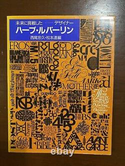
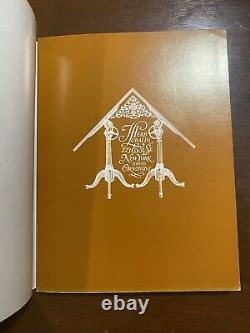
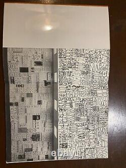
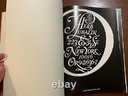
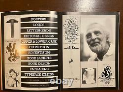
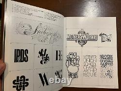
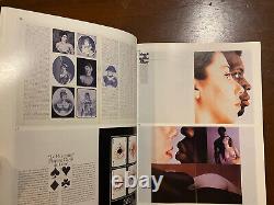
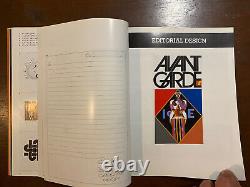
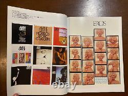
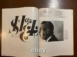
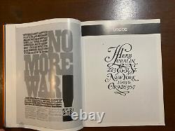
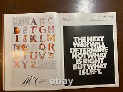
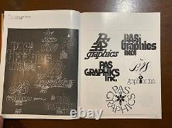
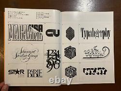
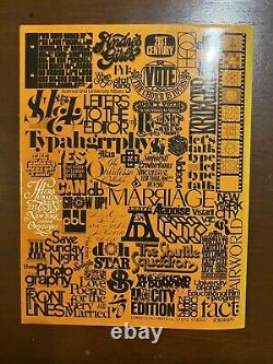


Herb Lubalin IDEA Extra Issue Magazine Japan. Format: Revised Edition - Orange Slipcase. Client/Publisher: Seibundo Shinkosha Publishing Co. Idea Extra Issue: Herb Lubalin.
Special Issue devoted to Herb Lubalin. 120 pages of Lubalin's work from 1956 - 1969. Parallel texts in Japanese and English.Fully illustrated in color and black and white. Perfect bound and stitched bindling loosening from wrappers. Faint dampstain to lower textblock corner.
A good copy only of this elaborate, extravagent tribute. 8.75 x 11.5 perfect-bound magazine with 119 pages devoted to the whole career of Herb Lubalin and his work in multiple areas and media.
Both front and back covers designed by Lubalin, commissioned for the issue. IDEA served as the Japanese equivalent of GRAPHIS -- a magazine dedicating to promoting the Graphic Arts of a certain region to the rest of the world. IDEA offers the contemporary viewer a glimpse into Japanese Graphic Design Culture as it emerged from the ashes of World War II and made its influence felt on a global scale.From the 1980 AIGA Medal Profile: Coming to terms with Herb Lubalin's work takes you quickly to the heart of a very big subject: the theory of meaning and how meaning is communicated -- how an idea is moved, full and resonant, from one mind to another. Not many have been able to do that better than Lubalin. It is where you start with Lubalin and what you eventually come back to. However, "typography" is not a word Lubalin thought should be applied to his work. What I do is not really typography, which I think of as an essentially mechanical means of putting characters down on a page.
It's designing with letters. Aaron Burns called it,'typographics,' and since you've got to put a name on things to make them memorable,'typographics' is as good a name for what I do as any. Lubalin was a brilliant, iconoclastic advertising art director -- in the 1940s with Reiss Advertising and then for twenty years with Sudler and Hennessey. Recipient of medal after medal, award after award, and in 1962 named Art Director of the Year by the National Society of Art Directors, he has also been a publication designer of great originality and distinction. He designed startling Eros in the early 60s, intellectually and visually astringent Fact in the mid-60s, lush and luscious Avant Garde late in the same decade, and founded U & lc in 1973 and saw it flourish into the 80s.
But it is Lubalin and his typographics -- words, letters, pieces of letters, additions to letters, connections and combinations, and virtuoso manipulation of letters -- to which all must return. The "typographic impresario of our time, " Dorfsman called him, a man who profoundly influenced and changed our vision and perception of letter forms, words and language. Lubalin at his best delivers the shock of meaning through his typography-based design. Avant Garde literally moves ahead. The Sarah Vaughn Sings poster does just that.
There is a child in Mother & Child, and a family in Families. If words are a way of making meaning, then the shapes of their letters give voice, color, character and individuality to that meaning. The shock of meaning, in Lubalin's artful hands, delivers delight, as well, delight that flows from sight and insight. "Lubalin, " praises Dorfsman, used his extraordinary talent and taste to transform words and meaning from a medium to an inextricable part of the message? And in so doing, raised typography from the level of craft to art. And it is in his paper U & lc that a lot of threads in Lubalin's life and career get pulled together. It is publication dedicated to the joyful, riotous exploration of the complex relationships between words, letters, type and meaning -- an ebullient advertisement for himself as art director, editor, publisher and purveyor of the shock and delight of meaning through typography and design.
