
- Magazine First Edition
- Author
- A Conan Doyle (5)
- Arthur Conan Doyle (7)
- Charles Dickens (3)
- Ed Sanders (4)
- Edgar Allan Poe (8)
- George Newnes (8)
- George P. Webster (3)
- Herman Melville (4)
- Japanese (5)
- Juan O Savin (6)
- Manly P. Hall (7)
- Mark Twain (6)
- Multiple (3)
- Multiple Authors (5)
- Poe (3)
- Radioshack (4)
- Royal Insurance Plc (3)
- Stephen King (10)
- Various (23)
- Various Authors (8)
- Other (3479)
- Book Title
- Era
- Features
- 1st Edition (864)
- 1st Edition, Graded (4)
- 1st Edition, Tmnt (4)
- Auto Racing (8)
- Cards (3)
- Collector's Edition (23)
- Complete Edition (3)
- Dust Jacket (4)
- First Edition (15)
- First Printing (5)
- Illustrated (33)
- Limited Edition (10)
- Lot (9)
- Nude (3)
- Original (4)
- Original Edition (4)
- Promo (2)
- Special Edition (6)
- Vintage (65)
- Vintage, 1st Edition (3)
- Other (2532)
- Format
- Language
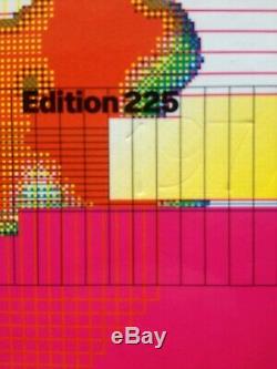
OCTAVO Journal 8VO Typography MINT Cond. Limited Edition Box Set Graphic Design
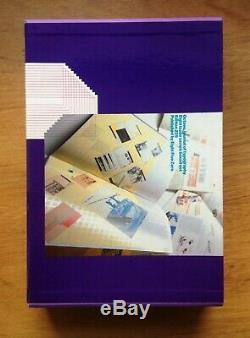
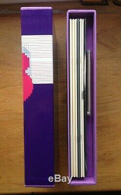
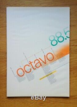
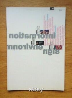
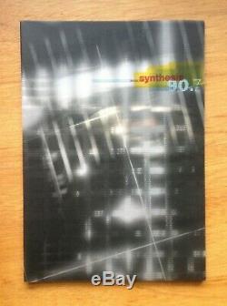
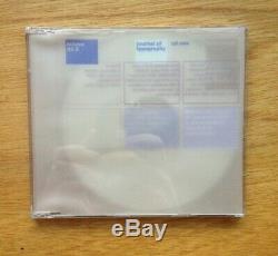


Limited Edition Box Set / No. London: Eight Five Zero, 1986.
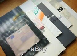
Simon Johnston, Michael Burke, Mark Holt, & Hamish Muir. Complete run; issues 17 saddle-stapled into printed card wrappers with wraparound glassine dust-jackets; final issue on CD-ROM. All issues in mint condition, still sealed in publisher's original packaging. All presented within a box. Simon Johnston and Mark Holt founded 8vo studio in 1984, and were soon joined by Hamish Muir (see Johnston's eponymous web site).
In 1986 they launched the influential journal Octavo for a planned run of eight issues. As the editorial in the first issue states.
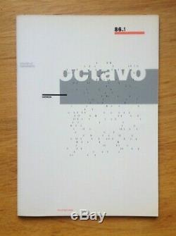
Octavo has evolved from a desire to see an independent publication which acts as a serious forum for the discussion of matters, both contemporary and historical, relating to typographic design. In its eight issues the journal will focus primarily on typography within graphic design, but will also investigate the way in which letterforms are used in the visual arts, poetry, architecture and the environment, as well as looking at broader matters such as design education. See condition description and photos for more info. Please see my other listings for more rare design titles. OCTAVO 86.1 [August 1986]: 16 pp text, 4 pp cover, 8 pp trace jacket.5 colours: black, red, grey, grey, grey varnish. Technics and Ethnics: The Work of Anthony Froshaug. Providing a unique insight into the work of this important typographer who combined an experience and understanding of European modernist design principles with a very English approach to typographic convention. On the design potential of the Mac. Richard Long's Art of Words.
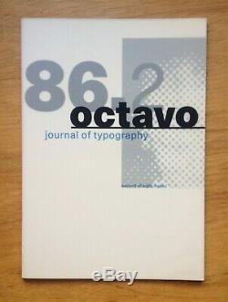
Addresses the use of type in Long's art, making this an important documentation of this aspect of the artist's work. OCTAVO 86.2 [January 1987]: 16 pp text, 4 pp cover, 8 pp trace jacket. 5 colours: black, blue, grey, varnish, varnish. Looks at Stefan Themerson's use of the internal vertical justification and discusses other related typographical works.A review of the work of designer and teacher Geoff White whose enthusiasm and dedication to typographic experimentation remain undiminished after thirty years. OCTAVO 87.3 [August 1987]: 16 pp text, 4 pp cover, 8 pp trace jacket.
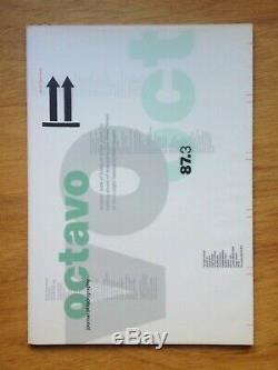
7 colours: black, green, blue, red, yellow, grey, varnish. Ian Hamilton Finlay: Terror and Virtue. A consideration of the duality and paradox in Hamilton Finlay's work. Where is the School of Thought?A demand for a reappraisal of values in design education. Architectural Typography: Willi Kunz at Colombia. Kenneth Frampton and Willi Kunz. Client and designer discuss Kunz's famous series of posters for the lecture programme at the Columbia University Graduate School of Architecture and Planning. OCTAVO 87.4 Weingart Issue [January 1988]: 16 pp text, 4 pp cover, 8 pp trace jacket.
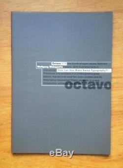
6 colours: 2 blacks, agrees, 2 varnishes! How can one make Swiss Typography?
An issue devoted to Wolfgang Weingart's seminal 1972 lecture manuscript, previously only available in photocopied format. Over 100 examples of work from Weingart's teaching at the Basel School of Design.
OCTAVO 88.5 lower case issue [August 1988]: 16 pp text, 4 pp cover, 8 pp trace jacket. 8 colours: black, blue-grey, blue, red, red, yellow, green and varnish. Large and small letters: authority and democracy. An in-depth study of Upper-and lower-case usage and parallel hierarchies.Lower-case in the Dutch lowlands. Offers a unique perspective upon the pioneering Dutch designers' lower-case campaign from the 20s, and its lasting effect on graphic design in Holland. Traces the development of lower-case usage in verse printing through to the adoption of all lower-case by concrete poets in the 50s and 60s.
OCTAVO 88.6 Environment issue [January 1989]: 16 pp text, 4 pp cover, 8 pp trace jacket. 36,000 die-stamped impressions: four weeks to print and 16 to finish! Argues for a reassessment of the changing relationship between signs and buildings.
Charts the fascinating development of typographic convention in timetable design from the 1830s to the present day. Reveals the secrets of registration plate coding systems from around the world, accompanied by die-stamped colour examples of plates photographed from his extensive collection. OCTAVO 90.7 The New Synthesis [July 1990]: 16 pp text, 4 pp cover, 8 pp trace jacket. 4-colour process, matt + gloss varnish.
The'ring neuer werbegestalter' 1927 - 1933. An important survey of the work of this pan-European movement with an informed assessment of the pioneering typographic approach common to all the ring's members who formulated many design principles still in use today. Questions conventional ideas of reading, legibility and typographic layout. Director of Cultural Services at the Musee d'Orsay discusses Philippe - Apleoig's innovative work for the museum and the Festival d'ete.
OCTAVO 92.8 Multi-media Issue [November 1992]: Macintosh compatible CD-ROM. 23.25 x 33 poster folded into eighths, as issued. A study of issues surrounding multi-media today, and those that will affect the future synthesis of emerging communications media. The CD-ROM format of this final issue is aimed at an audience of fellow designers and typographers, attempting to raise awareness of the coming changes in information technology, which will fundamentally redefine both our modes of communication and the role of design. Research by Deborah Marshall and Bridget Wilkins. Simplicity of form is never a poverty, it is a great virtue. - Jan Tschichold, quoted by the editors in issue 1. The item "OCTAVO Journal 8VO Typography MINT Cond. Limited Edition Box Set Graphic Design" is in sale since Thursday, February 13, 2020.This item is in the category "Books, Comics & Magazines\Magazines\Architecture, Art & Design". The seller is "kidfrisbee" and is located in Falmouth, Cornwall. This item can be shipped worldwide.
- Publication Name: Octavo
- Subject: Typographic Design
- Publication Year: 19861992
- Special Attributes: Boxed Set

